Optimizing Navigation: How to Help Users Find What They Need Fast
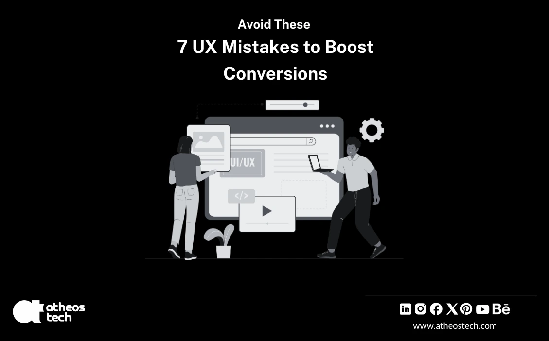
Have you ever wondered why your website is getting plenty of web traffic but your leads aren’t growing? You’re not alone. Across industries, whether it’s a global eCommerce giant, a SaaS startup in Europe, or a luxury lifestyle brand in the USA, businesses often overlook one critical factor: UX Design Services.
At AtheosTech, we’ve seen firsthand how a polished design paired with a weak user experience (UX) can quietly drain revenue. The truth is, bad UX doesn’t just frustrate visitors; it kills trust, slows conversions, and leaves opportunities on the table. The good news? These mistakes are common, and they’re fixable.
So, let’s sit down together, almost like a strategy session.
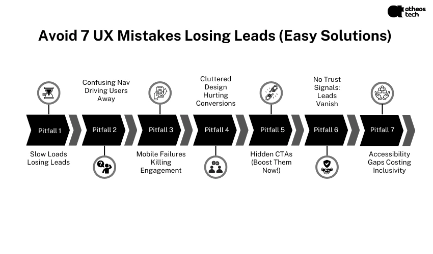
Imagine you’re on the BBC’s global news site, trying to catch up on breaking stories. If the page takes more than three seconds to load, you’re already thinking about leaving. In fact, the BBC once discovered that they lost 10% of their users for every additional second of load time. That’s millions of lost impressions and revenue, just because of poor performance.
Today’s users expect instant access. A delay of even two seconds makes them bounce, damaging both conversions and brand perception.
When we deliver ui ux design and development services, we don’t just think about beauty; we ensure your site is lightning fast.
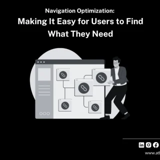
Think of your navigation as the roadmap. If visitors can’t find what they need, they leave, fast. One SaaS platform we audited, Slabstack, buried key features under layers of menus. The result? Confused customers, high churn, and endless support tickets.
When menus are cluttered or illogical, users feel lost. That frustration directly translates into fewer conversions.
With our ui/ux design service, we help brands restructure navigation so that customers flow naturally toward conversions instead of feeling trapped in a maze.
Here’s a number that stings: over 60% of global web traffic comes from mobile devices. If your site isn’t mobile-friendly, you’re saying goodbye to more than half your potential leads.
Take Asana, the popular project management tool. Their early mobile app had clunky navigation and limited functionality. The result? Negative reviews, poor ratings, and lost revenue.
Bad mobile UX equals instant frustration. People don’t “pinch and zoom” anymore; they exit and head to competitors.
Our ui ux design services company ensures mobile isn’t an afterthought, it’s a priority. After all, your leads are scrolling on their phones, not desktops.
Every second of bad UX costs you leads. With AtheosTech’s UX Design Services, you can fix these issues fast.
Luxury brands know this: elegance is in simplicity. Yet many websites still overwhelm users with flashy banners, competing CTAs, and endless pop-ups. The result? Decision paralysis.
CloudConvert, for example, once crammed too many calls to action on a single landing page. Users didn’t know what to do next, and left instead of signing up.
When everything screams for attention, nothing stands out. Your core CTA gets lost in the noise.
Our UI/UX design agency blends aesthetics with clarity. Think of it as digital minimalism with maximum impact.
A CTA is like a handshake; it guides the user toward the next step. If it’s buried or vague, conversions collapse.
Users won’t dig for what to do next. If your “Buy Now” or “Get a Quote” button isn’t visible, your funnel leaks.
Our ui & ux design services focus on guiding visitors seamlessly from curiosity to conversion, without confusion.
Would you give your credit card details to a site that looks shady? Probably not. And neither will your customers.
Slack once faced backlash when visually impaired users found their app inaccessible. Though not a direct “trust badge” issue, it hurt their credibility in inclusive workplaces. Accessibility isn’t just compliance; it’s a trust factor.
No testimonials, missing case studies, or a lack of security seals make users hesitate. Trust gaps = lost leads.
With our ux audit services, we don’t just flag design issues; we highlight missing trust signals that could be sabotaging your conversions.
Accessibility is often overlooked, but it’s one of the most common UX mistakes with the highest impact. Roughly 15% of the global population lives with some form of disability. Ignoring accessibility means excluding millions of potential users.
Excluding users with visual, auditory, or motor impairments reduces your audience reach and can harm your brand reputation.
Our ui ux design and development services include accessibility audits because inclusivity isn’t optional; it’s essential.
Here’s the bottom line: good UX isn’t just “nice to have.” It directly impacts:
Bad UX is costing you money right now. The longer you ignore it, the more potential leads you lose.
If you’ve recognized any of these mistakes in your own site, don’t worry, you’re not alone. Even global brands like Slack, Asana, and BBC have stumbled. The difference is, they fixed it.
That’s where we come in. At AtheosTech, we specialize in UX Design Services that don’t just look beautiful but drive measurable business results. Whether you need a full redesign, ux audit services, or tailored ui ux design and development services, we’ve got you covered.
Your customers deserve seamless, elegant, and engaging experiences. And you deserve the leads and revenue that come with them.
Let’s transform your website into a high-converting powerhouse. Talk to our team today.
Adding {{itemName}} to cart
Added {{itemName}} to cart