- AtheosTech
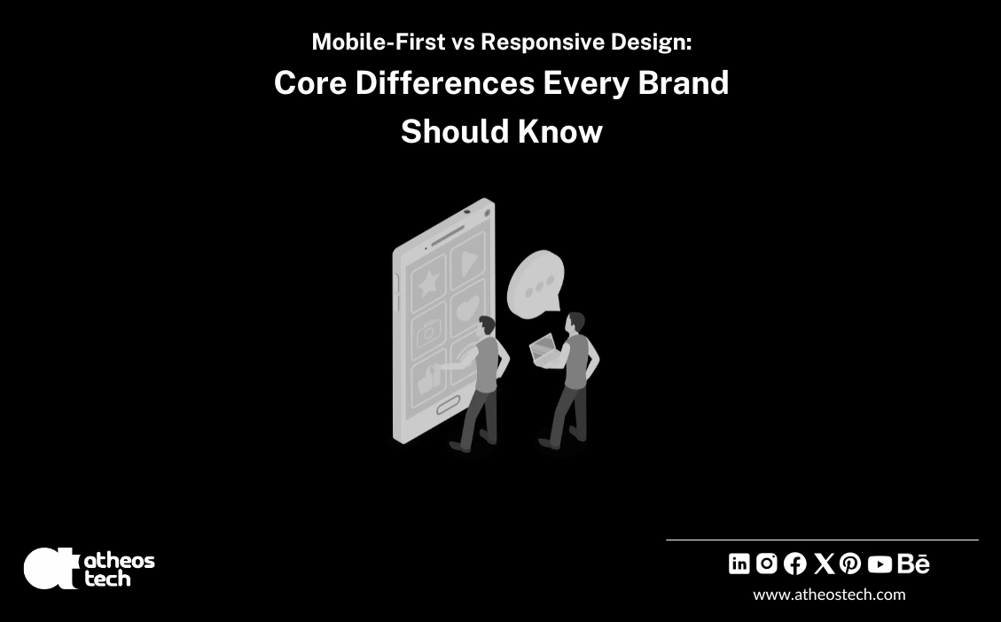
Difference Between Mobile-First and Responsive Web Designs
Learn Why Mobile-First Design Is Changing the Way We Build Websites
Let’s face it, in today’s fast-paced digital world, your website isn’t just your online identity; it’s your first impression, your salesperson, and often your most powerful marketing asset. At AtheosTech, a global web design agency, we’ve seen firsthand how the smallest design decision can determine whether a visitor stays to explore… or leaves in frustration after a few seconds.
One of the biggest choices businesses face today is deciding between a mobile-first website and a responsive website. At first glance, they might sound identical; both adapt to different devices and screen sizes, right? But here’s the catch: while every mobile-first website is responsive, not every responsive website is truly mobile-first.
That’s the difference between reacting to technology and designing for it. Let’s break it down, simply, technically, and from the perspective of experts who build digital experiences that truly enhance user experience across all platforms.
Table of Contents
What Exactly Is a Responsive Web Design?
Think of responsive web design as digital water; it flows and reshapes itself to fit any container it’s poured into. Whether a visitor opens your website on their phone, tablet, or desktop, a responsive website adjusts its layout, text, and visuals automatically.
It uses fluid grids, flexible images, and media queries to adapt to different screen widths and orientations. This design ensures that your site looks beautiful and functions smoothly on everything from small screens to large monitors.
A responsive approach is ideal for brands aiming for consistency, especially when your users are scattered across tablets and desktops, mobile phones, or even smart TVs. You’re essentially creating a single design that flexibly stretches across devices and screen sizes.
That said, a responsive site is reactive by nature; it rearranges elements to fit a screen but doesn’t necessarily prioritize how users interact with those screens. This is where mobile-first web design steps in.
What Is Mobile-First Web Design?
The mobile-first approach flips traditional thinking. Instead of starting with the desktop version and scaling down, designers begin with the smallest screen sizes, the mobile experience, and scale upward.
This approach assumes your audience is mobile-first, which, today, most of them are. According to global digital behavior studies, more than 70% of online users engage with websites on their mobile phones before ever switching to a laptop.
A mobile-first website is intentionally designed for the mobile user, prioritizing ease of navigation, faster load times, and simplified visuals that deliver a seamless user experience.
We design from this perspective every day. Our experts ensure that every tap, swipe, and scroll feels effortless. We create designs that not only fit smaller screens but are crafted for them.
That’s the art of a mobile-friendly design, it’s built with the real-world user in mind, not just resized for convenience.
The Core Difference: Reactive vs. Proactive Design
Here’s where many businesses get it wrong. A responsive website is like a chameleon; it reacts to the environment (screen size) and changes its look accordingly. But a mobile-first website is like an architect designing a home knowing the land, the weather, and how people will live inside it.
It’s a proactive approach. It focuses on crafting the most efficient experience possible for mobile screens first, where simplicity, clarity, and speed matter most.
Let’s visualize it:
| Aspect | Mobile-First Web Design | Responsive Web Design |
|---|---|---|
| Starting Point | Smallest screens first | Desktop screens first |
| Design Focus | Prioritize mobile usability | Maintain flexibility |
| Performance | Faster load times | Balanced speed across devices |
| Navigation | Simple, thumb-friendly | Scales from desktop menus |
| User Experience | Optimized for mobile interactions | Consistent layout across screens |
Why Mobile-First Matters More Than Ever
It’s simple, mobile traffic dominates the internet. Your audience isn’t waiting to get home and open a laptop. They’re searching, scrolling, and shopping on their phones while standing in line for coffee.
A mobile-first website recognizes this behavior. It trims unnecessary clutter, eliminates slow-loading elements, and focuses on what truly matters: speed, clarity, and engagement.
This design ensures that users don’t have to zoom in, pinch, or scroll endlessly. It feels fluid and intuitive. And yes, it directly improves your SEO, too.
Google’s mobile-first indexing means the search engine evaluates your website primarily from its mobile version. So, a mobile site that’s fast, clean, and engaging stands a far better chance of ranking higher.
In other words, the mobile-first approach doesn’t just look modern, it performs better, converts faster, and builds stronger brand impressions.
The Role of Responsive Web Design Today
Does that mean responsive design is outdated? Not at all. It’s still a cornerstone of modern web development.
A well-optimized responsive website delivers a consistent user experience across all devices, ensuring your brand looks sharp on every platform. It’s especially effective when you’re targeting a broad demographic, people who browse from both tablets and desktops.
For example, international web design firms or web design companies near me often choose a responsive approach to maintain design harmony across regions and devices.
Responsive web design is ideal for small business website design projects where budget efficiency and simplicity are top priorities. You get one adaptable design that looks professional everywhere.
Plus, maintenance becomes easier. Update a headline, swap an image, or tweak a section, and those changes reflect instantly across all versions. That’s the beauty of efficient, unified web design services.
“Ready to give your website a seamless, responsive design?”
Mobile-First Design vs Responsive Web Design:
Key Differences You Need to Know

1. Design
Approach
Mobile-First Design: Starts with mobile screens first and scales up for larger devices.
Responsive Web Design: Builds one flexible layout that adapts to all screen sizes.
2. Development
Priority
Mobile-First Design: Prioritizes mobile users’ needs and performance.
Responsive Web Design: Focuses on universal accessibility across devices.
3. User Experience
(UX) Focus
Mobile-First Design:Ensures fast, simplified UX for mobile users.
Responsive Web Design: Maintains consistent UX across all platforms.
4. Performance Optimization
Mobile-First Design:Optimized for speed and minimal loading on mobile.
Responsive Web Design: May require more optimization for mobile performance.
5. Content
Strategy
Mobile-First Design: Displays essential content first, avoiding clutter.
Responsive Web Design:Adapts all content to fit different screen dimensions.
6. Design
Complexity
Mobile-First Design:Grows in complexity as screen size increases.
Responsive Web Design: Uses fluid grids to resize elements automatically.
7. SEO Impact
Mobile-First Design:Aligned with Google’s mobile-first indexing for better rankings.
Responsive Web Design: Enhances SEO through consistent URLs and adaptable design.
Which One Should You Choose?
The right answer depends on your goals.
If you’re a small business web design client focusing on local reach, or someone searching “web design companies near me” to build an all-device presence, a responsive website is a fantastic, cost-effective solution.
But if your audience is predominantly mobile, think eCommerce brands, lifestyle startups, or digital-first platforms, a mobile-first website will deliver a superior experience on mobile devices.
We don’t just choose one over the other; we blend the best of both worlds. As a best web design company with global expertise, we analyze your audience data, traffic sources, and business goals before suggesting the ideal path.
Our custom web design services go beyond templates. We engineer websites that balance aesthetics, performance, and strategy, ensuring your visitors enjoy a flawless user experience across all devices.
How AtheosTech Elevates the Web Experience
Designing a beautiful website is easy. Designing one that performs beautifully is where we stand apart.
We don’t just design pages, we build digital experiences that convert. Whether it’s responsive web design or a mobile-first website, our goal is to make every pixel purposeful.
Our process starts with understanding how your users behave, where they browse, what they click, how long they stay, and then creating a mobile-friendly design that guides them effortlessly toward action.
From fluid grids, flexible images, and media queries to adaptive content that adjusts intelligently, every website we craft delivers a seamless user experience and drives measurable results.
So, whether you’re a startup looking for small business website design or an enterprise searching for website design companies near me, we deliver precision, performance, and perfection.
Final Thoughts
In the ever-evolving world of web design agency, the debate isn’t really “mobile-first vs. responsive.” It’s about understanding your audience and choosing a design philosophy that aligns with how they live, scroll, and shop.
A responsive website ensures inclusivity, and your digital presence flows across screens gracefully. A mobile-first website, on the other hand, focuses sharply on creating the best possible user experience on mobile devices, fast, intuitive, and modern.
At AtheosTech, we believe the future of digital design lies in intention. The intention is to build for the user, not just the screen. The intention is to make every interaction feel effortless. The intention is to combine creativity with performance.
So, if you’re ready to reimagine your website’s experience, partner with AtheosTech, the web design agency trusted by businesses worldwide. Our team will help you craft a site that performs beautifully, looks luxurious, and keeps your users coming back for more.
FAQ's
Mobile-first design starts by creating the website for mobile devices first and then scales up for larger screens. Responsive design, on the other hand, adapts an existing layout to fit different screen sizes automatically.
Because most users access websites through smartphones, mobile-first design ensures that the mobile experience is smooth, fast, and user-friendly - which directly improves engagement and conversions.
Yes. Responsive design ensures your website looks great on all devices - from phones to desktops. Mobile-first focuses on design strategy, while responsive ensures a flexible display across devices.
Both help SEO, but mobile-first design has an edge since Google uses mobile-first indexing. A site optimized for mobile devices ranks better in search results.
Not necessarily. While it may require more planning and testing upfront, mobile-first design often reduces long-term costs by preventing layout issues on smaller devices.


