- AtheosTech
What is Mobile App Design? A Beginner’s Introduction
A simple guide to understanding how intuitive mobile experiences are designed
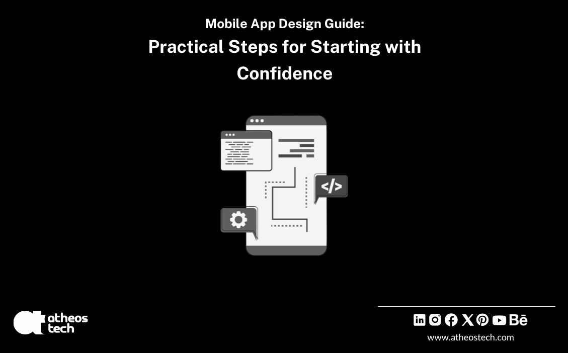
Table of Contents
Key Takeaway
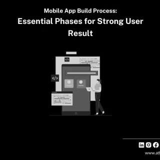
- Mobile App Design forms the structural and visual foundation of every successful mobile application, guiding user interface interactions, navigation, and overall experience.
- Strong design integrates UI excellence with UX clarity, ensuring mobile applications operate smoothly across iOS and Android environments.
- A well-defined framework involving research, wireframes, prototypes, accessibility, and testing leads to responsive, visually appealing, and high-performing digital products.
- Modern mobile app design agencies and app design firms rely on standardized systems, platform guidelines, and advanced design tools to deliver dependable results that meet user expectations.
- A strategic mobile app design process accelerates development time, strengthens engagement, and establishes a competitive advantage in the app store ecosystem.
What is Mobile App Design?
Mobile App Design has become a critical foundation for digital products in an era where mobile screens dominate daily interactions. The process expands beyond colors, icons, and visuals; it shapes interactions, defines navigation flow, and creates frictionless movement across all screens. Companies across industries rely on structured systems led by a mobile app design agency, app design firm, or specialized teams offering Mobile App Design Services to deliver polished, intuitive, and platform-compliant applications.
A mobile application’s success often depends on how naturally users transition between screens, how intuitive ui elements appear, and how seamless each touchpoint feels. Expert design teams ensure alignment with iOS and Android standards, maintain brand identity, and build responsive layouts that elevate engagement.
Understanding Mobile App Design: A Simple Definition
Mobile App Design represents a complete creative and functional process focused on shaping the UI and UX of a mobile application. Core components include:
- Visual layout
- Navigation flow
- Design elements
- Interactive behavior
- Branding consistency
- Accessibility
This process transforms ideas into predictable real-user journeys. Established guidelines from Apple and Google influence UI structures, transitions, typography rules, and interaction patterns across Android apps and iOS ecosystems.
Earlier mobile applications delivered limited interactions and simple interfaces. As display sizes expanded and user expectations advanced, design methodologies evolved. Responsive design for mobile apps became essential, prompting mobile application design services and mobile application interface design teams to prioritize immersive, human-centered experiences.
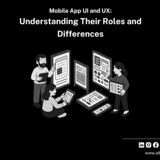
Why UX and UI Matter in App Design
A mobile application’s performance relies heavily on UX and UI. These pillars determine movement, comprehension, and overall interaction quality across all screens.
User Experience (UX)
UX focuses on the journey across screens. Strong UX design:
- Reduces cognitive load
- Eliminates unnecessary steps
- Supports fast goal completion
- Minimizes drop-offs and friction
A refined UX strategy establishes clarity, shaping a usable and enjoyable mobile application.
User Interface (UI)
UI defines the visual system that structures the application’s appearance. Strong UI incorporates:
- Recognizable icons
- Accessible button sizes
- Legible typography
- Consistent layouts
UX and UI collectively form the blueprint that design and development teams follow. Clear assets streamline design and development, reducing errors and shortening development time.
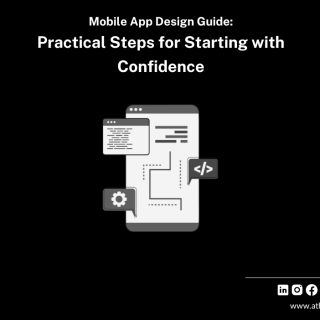
A Complete Guide to Mobile App Design for Beginners
A structured Mobile App Design process provides clarity from concept to deployment.
Step 1: Define a Clear Vision
A strong mobile application begins with clarity:
- Identifying the core problem
- Recognizing the target beneficiary
- Establishing key feature interactions
A clear vision directs all design decisions and prevents unnecessary features that slow performance or dilute app value.
Step 2:
Conduct Discovery and Research
Thorough research informs strategic decisions. This phase includes:
- Competitor analysis
- Market expectations
- Industry standards
- Persona understanding
- Platform preference reviews
Insights gathered here influence layout, design style, feature selection, and the type of app that emerges from the design process.
Step 3:
Map User Journeys
User journeys visualize how individuals move from onboarding to final action. Mapping reveals:
- Primary touchpoints
- Obstacles
- Key interaction moments
- Areas for simplification
This structured approach ensures natural, predictable navigation patterns.
Step 4: Choose the Right Design Tools
Modern tools accelerate design efficiency.
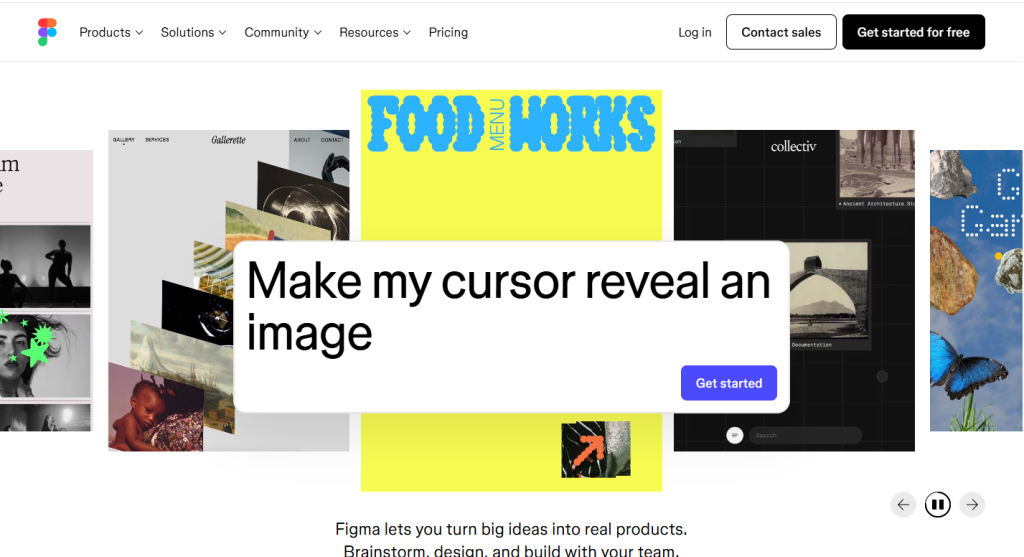
Figma – Cloud-based interface design and prototyping.
Sketch – Digital design software for UI/UX workflows.
Adobe XD – Vector-based UI/UX design and prototyping tool.
Framer – No-code interactive design platform.
UXPin – Code-based prototyping and design systems platform.
Miro – Visual collaboration environment.
Balsamiq – Low-fidelity wireframing tool.
Figma is a popular, cloud-based collaborative interface design and prototyping tool used by individuals and teams to create websites, user interfaces (UI), user experiences (UX), and other digital products. It operates primarily in a web browser but also offers desktop applications for macOS and Windows.
The term “sketch” can refer to several different things, primarily a rough drawing or painting, a digital design software, or an online content creator.
Adobe XD is a vector-based design and prototyping tool for creating user interfaces (UI) for websites, mobile apps, and other digital products. It allows users to design and create interactive prototypes and share them for feedback without coding.
Framer can refer to two distinct things: a popular no-code web design and publishing tool and a skilled construction tradesperson.
UXPin is a comprehensive user experience (UX) design platform that provides tools to ideate, prototype, document, and build design systems using a unique code-based approach. It bridges the gap between design and development by using the same components for both, streamlining workflows and ensuring consistency.
The term “Miro” can refer to several different things, primarily a popular visual collaboration platform, the famous Spanish artist Joan Miró, or an acronym used in the SAP system.
Balsamiq is a software company that develops fast, low-fidelity wireframing tools to help product teams quickly sketch and iterate on user interface ideas. It’s tools for non-designers like product managers, founders, and engineers to share concepts and align their teams quickly.
These platforms support:
- Real-time collaboration
- Prototyping
- Component creation
- Design systems
- Developer handoff
With the right environment, mobile app design and development services operate efficiently with minimal revisions.
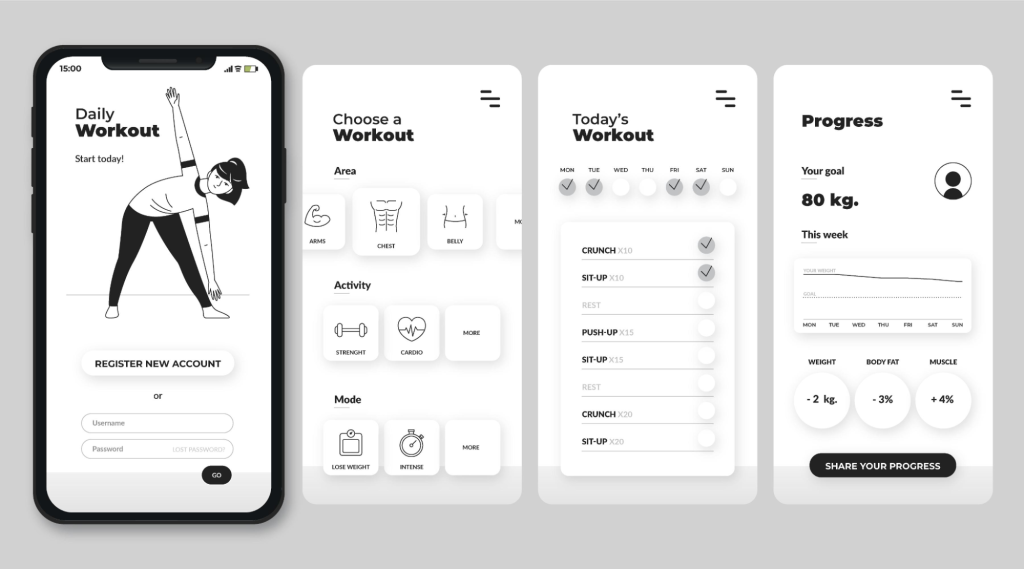
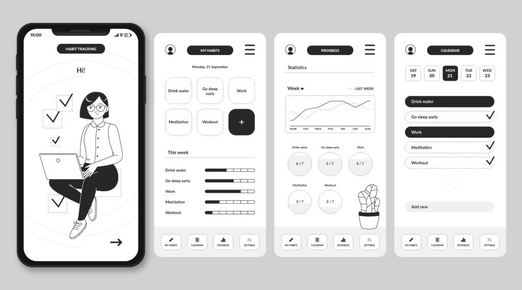
Step 5: Create Wireframes
Wireframes form the blueprint of the mobile application, defining:
- Screen structure
- Content hierarchy
- Navigation flow
- Positioning of ui elements
This stage focuses exclusively on functionality, laying a foundation before visual styling begins.
Step 6: Build Interactive Prototypes
Prototypes turn wireframes into testable, interactive constructs. This stage reveals:
- Friction point
- Navigation inefficiencies
- Interaction behavior
- Experience gaps
Testing prototypes with real user behavior long before development conserves resources and streamlines decision-making.
Step 7: Craft Visual UI and Design Elements
Visual design finalizes the look and feel of the mobile application. Key components include
Color schemes
Color schemes are combinations of colors used in design to create a specific mood or aesthetic appeal, based on their relationships on the color wheel.
Icons and illustrations
Icons and illustrations are both visual communication tools, but they differ primarily in their complexity, level of detail, and intended use. Icons are simple, highly stylized graphic symbols designed to represent a specific idea, object, or function at a small size, while illustrations are more detailed and artistic, serving a broader narrative or decorative purpose.
Typography
Typography is the art and technique of arranging text to make written content readable, legible, and visually appealing. It involves selecting typefaces, adjusting font sizes, line lengths, and spacing, and is a crucial tool for designers to improve user experience, create visual hierarchy, and build brand identity.
Spacing
Spacing is the distance between objects, elements, or text. It can refer to the space between letters, words, and lines in a document, or the distance between players on a sports team. Proper spacing is crucial for readability, aesthetics, and creating a sense of order.
Brand identity
Brand identity is the collection of all visual, verbal, and experiential elements that define a company, like its logo, color palette, typography, and voice. It's how a business presents itself to the world and is crucial for creating a unique image, attracting customers, and building trust and loyalty.
Platform-specific components
Platform-specific components are software elements, libraries, or user interface (UI) elements designed to leverage the unique functionalities, design guidelines, and underlying APIs of a particular operating system or environment.
High-quality UI blends clarity, brand expression, and platform compliance through polished visual execution, especially under the guidance of a professional mobile app design agency.
Step 8: Design for Accessibility
Accessibility ensures inclusive, barrier-free experiences. Essential elements include:
- High contrast
- Large tap targets
- Screen-reader support
- Responsive scaling
- Alternative text
Accessibility strengthens usability for all individuals and extends the application’s reach.

Step 9: Test, Iterate, Improve
Testing validates performance under real conditions. Teams evaluate:
- Usability tests
- A/B comparisons
- Heatmap responses
- Analytics insights
Continuous refinement drives long-term quality, supported heavily by mobile application design services implementing ongoing improvements.
Step 10: Integrate Push Notifications
Push notifications enhance engagement and reinforce application presence. Effective strategies improve
Retention
Retention is the act or ability of keeping something or someone. The term is used in various contexts, including business, medicine, education, and law, each with a specific application of the general definition.
Activation
Activation generally means the process of starting something, making it active, or enabling a function. The specific meaning depends on the context, as the term is used in software, science, and marketing.
Conversions
Conversions refer to the act of changing something from one form or state to another, such as changing units of measurement (e.g., grams to milligrams), a physical space (e.g., a loft conversion), or beliefs (e.g., a religious conversion).
User loyalty
User loyalty refers to a customer's consistent, positive relationship with a brand or product, characterized by repeat purchases and advocacy. It stems from factors like exceptional customer service, brand value alignment, and product quality.
Structured planning ensures notifications deliver value without overwhelming users.
What Users Expect from Modern Mobile App Design
Modern expectations emphasize simplicity and efficiency. Users expect mobile applications to:
- Load rapidly
- Deliver natural guidance
- Respond instantly
- Maintain structural consistency
- Provide effortless navigation
Complexity, delays, or unclear flows often result in abandonment. Strong UX pathways and consistent testing maintain engagement.
Creating Wireframes and Mockups
Wireframes represent structure; mockups represent aesthetics. Together, they establish shared alignment across design teams and mobile application design agency partners.
Key considerations include:
- Screen count
- Layout organization
- Hierarchy prioritization
- Visual direction testing
Mockups combine structure with UI elements to preview the final experience before development begins.
Final Thoughts
Mobile App Design delivers the foundation for high-performing digital products, shaping experiences that resonate with real users. With structured workflows, refined UX/UI principles, accessibility adherence, and continuous iteration, organizations gain mobile applications built for performance and long-term relevance. Expert support from partners such as AtheosTech, a trusted Mobile App Development Company in the USA, ensures clarity, precision, and elevated quality across every stage of the mobile app design and development process.
FAQ's
Mobile app design focuses on touch interactions, smaller screens, gesture-based navigation, and platform-specific guidelines for iOS and Android. The experience must be faster, more intuitive, and optimized for on-the-go usage.
A standard design cycle ranges from 3–8 weeks, depending on complexity, number of screens, research depth, prototyping needs, and the level of refinement required for a premium UI/UX finish.
Absolutely. UX shapes the experience and flow; UI shapes the visual identity and interactions. Together, they create an intuitive, engaging, and reliable product that users instantly understand.
Costs vary based on complexity, platform count, number of screens, research needs, and design quality expectations. Most professional projects fall into a structured range, from simple MVP designs to enterprise-grade UI/UX systems.
Prototyping is essential because it reveals how users actually interact with the app before development begins. It exposes friction points, validates user flows, and reduces costly changes later in the process.